

LEE ROBINSON Home 248.470.1174
T

CASE STUDY: Work Style and Ethic.
Insight
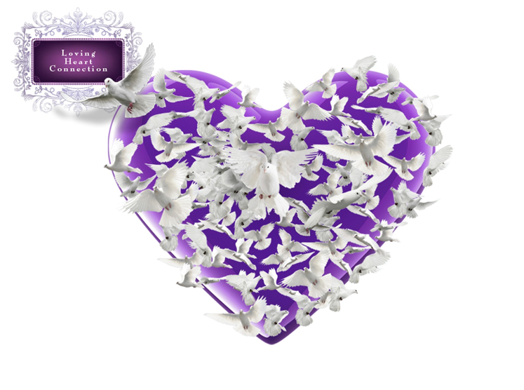

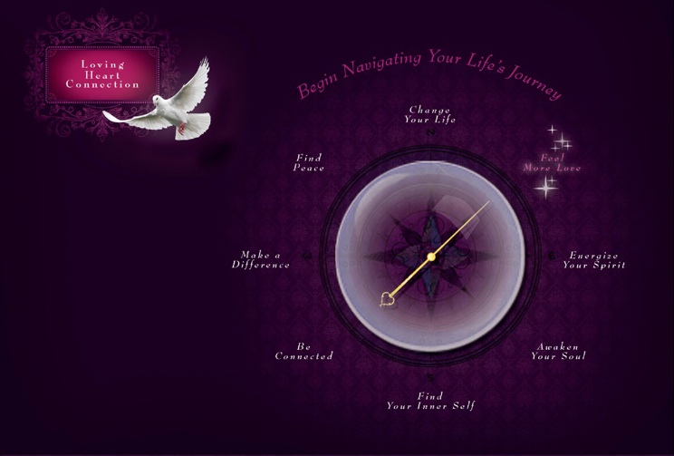
Beginning your journey on the site started by guiding your cursor to the center of the heart and clicking as the doves moved aside to let you in.
A small business owner — spiritualist, and author of her new book, The Loving Heart.
I was approached to estimate a basic web design template that included a home page and one interior page. The client wanted the website to enlighten and share her spiritual perspectives of life’s journey. She also wanted the site as a place to market her new book. As well, the website – like her book – needed to help readers NAVIGATE through life’s journey. The site architecture was to be handled elsewhere.
She LOVED doves and the color purple for it’s spiritual meaning. That’s it. Other than that it was a clean canvas. The book jacket was not yet designed, and there was no other design reference to go by.
First task was to share with client, this is more of a brand creating exercise using the website as the media tool than a simple website design. She would need a logo of sorts and serious thought into her brand essence through typography, imagery and voice as there were no existing rules to follow. Noting her personality, I also suggested skewing towards a feminine flair cautioning not to alienate the male demographic. She liked the idea and agreed.
• Deep thought into her personalized brand based on the right balance of her essence, requests and
the need to appeal to her customers.
• Concept IDEAS of ways the website can demonstrate her spiritual belief of life’s journey and
navigating through it.
-
• Designing the home page and interior template.
-
• The use of doves and purple.
-
• And 3 concepts she was going to love.
THE CLIENT:
THE TASK:
PARAMETERS:
DISCUSSION:
THE PROMISE:


Concept 1
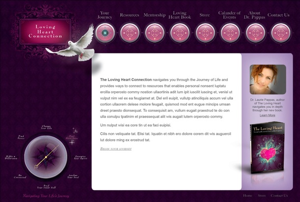
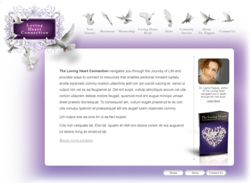
The first concept primarily spoke to the inner core idea of the book and spiritual perspective — that we are all connected and that life’s journey is best explored with love. Though not a true logo design, as budget didn’t allow for it, I felt it necessary to personalize and establish a look for the site name with some sort of logo treatment. I created a simple home page for each to help create awareness for her brand and new business. The landing page was then the basis of design for all interior pages. Navigating life’s journey was secondary in this concept, and was spoke to through verbiage.
I also threw in book cover designs as inspiration. Shortly after I was asked to estimate the book design.


The dial would spin in the direction of the cursor, and the journey selection would glow with stars.

Concept 2
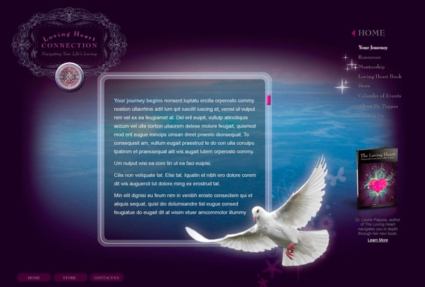
This concept primarily focused more on a fun and intriguing way for the customer to navigate through life’s journey. The navigation ball was an iconic and memorable tool that would be transferred onto many of the interior pages. I created navigation graphics instead of the doves as journey buttons. And along with a second book cover design, I also created a consistent portrait photo look.

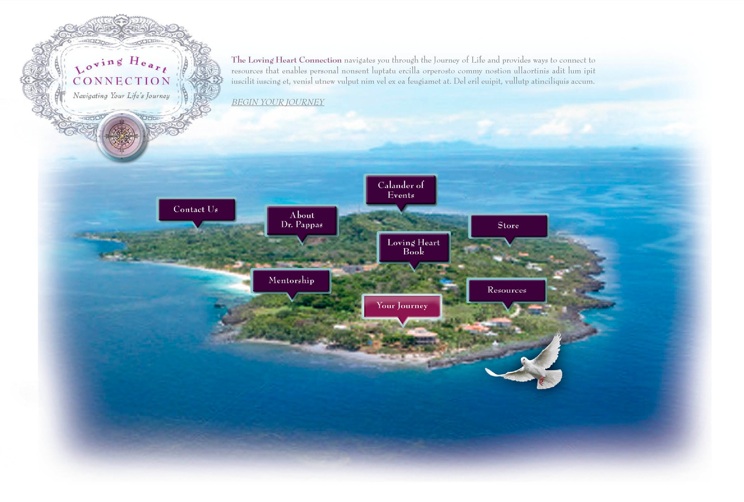
What better way to navigate around an island than a flying dove as a cursor.

Concept 3
This concept used an island as a graphic representation of life’s journey. The reader would navigate their way around by selecting areas on the island. Above was a brief synopsis. And another logo treatment that fit better with this concept.
Just to note, The client was immediately in love with all three and brought tears as she said the creative captured the spirit and emotion of her inner being and her spirituality. Going far beyond what she expected. After a week of deciding, she went with concept 1.
As a basic design job, it was business as usual.
